So…here’s the scenario. You worked for hours on your presentation for a big meeting. It’s always a little daunting and stressful to get in front of a room full of your peers and you want your presentation to go smoothly. On the day of your big presentation while going through the slides on the projection screen, you notice your slides are looking “off” something is not right. What could it be?
If you did not have a chance to conduct a pre-test of your presentation on this projector don’t be surprised that there will be some differences between your monitor and the projector screen. Projectors tend to not display the colors exactly as they appear on your computer screen. This can lead to colors and images that look great on your monitor, but end up not looking very good when they are projected onto a screen.
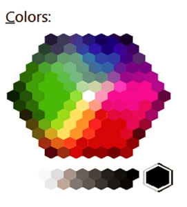
Your nice pale greens have turned into a blinding florescent green and not to mention your yellows have become a muddled brown. The beautiful shades of blue you used to create a complicated bar graph all look like the exact same color.
Your thoughtfully crafted slides have become eyesores to look at.
Your company branded palette, may work well for printed material but may not translate well to a projector. The colors in your presentation may need to be adjusted to a different shade in order to present better and yet still retain your company branding.

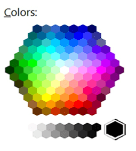
Color Palette on Monitor

Simulation of Color Palette
Solution:
Test, test test! If possible, test on the screen you will be presenting on. IF that is not possible, opt for a color scheme of contrasting colors that are more saturated—the more muted the colors on your monitor, the more likely they will blend together on the projection.
Your company branded palette, may work well for printed material but may not translate well to a projector. The colors in your presentation may need to be adjusted to a different shade in order to present better and yet still retain your company branding.
So what’s the takeaway here?

Monitor View

Monitor View

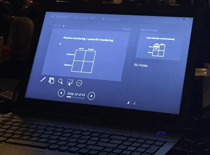
Projection Screen

Projection Screen
In general, good rules to remember:
- Test colors on the presentation projector or monitor whenever possible
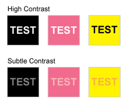
- Avoid subtle color combinations as they do not show well on a projector
- Avoid vibrating color combinations, like red and green, as those colors which appear to “vibrate” when viewed on a screen as some in your audience may have red green color blindness or it can give some people a headache (see below)
- Use high contrast color combinations which are a safer bet for presentations. Background and text need to have enough contrast for readability. (see below)
With some careful planning and testing of your color palette your presentations should be appealing and memorable (in a good way).


Leave A Comment